…
Typography
Question 1
Define the term “typography” in your own words.
Typography is the art of arranging words and letters and their relation to each other. Typography is actually a subset of lettering, because it is the study of letters applied to typefaces.
Write a few sentences explaining what typography is not.
Typography is not handwriting, graffiti, lettering, carving letters into stone or wood by hand, sign-writing and building letters out of matchsticks. Typography does not involve producing any unique and individual letters by hand or tool. Typography is also NOT something you learn overnight.
Find a case study on typeface development on the internet. Explain which medium the font developed is best suited for and why. Keep legibility, size and style in mind.
http://www.monotype.com/resources/case-studies/a-stackable-typeface-for-dominos-pizza/
Weinzierl was tasked with creating a typeface that would introduce a ‘contemporary’ feel, while working alongside the Trade Gothic® design already in use. The typeface is made to be used in packaging, signage and TV spots, and any environment where Domino’s branding is being used. It is not suited as well for web or body text as the typeface involves a lot of details and shading that would make the longer text strenuous to read.
Question 2
Question 3
Sketching Techniques
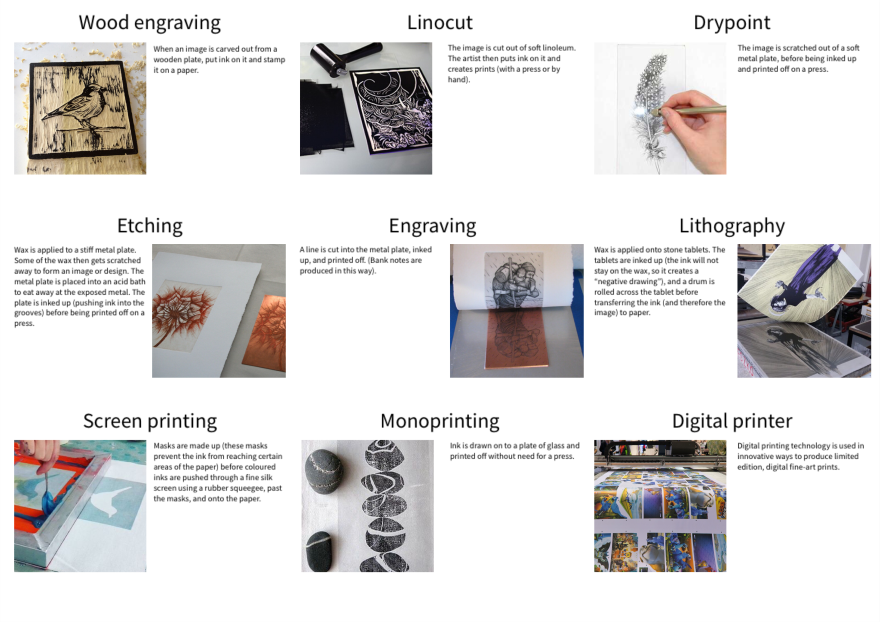
Define, in your own words, the printmaking terms.
Find examples on the Internet to represent each of those terms.
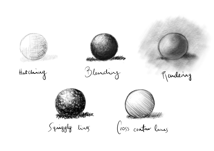
Use your graphite, eraser, eraser putty and blending stub to sketch spheres using the following techniques: hatching and cross hatching, blending, rendering, squiggly lines and cross contour lines. (Please scan your sketches and upload them to your blog.)
Graphic Design History
Bauhaus
A building school ”Architecture, Interior Design, Graphic Design, Industrial Design & Typography”
Joining fine arts + arts & crafts. Walter Gropius
Philosophy: Push students to explore art and design in new directions
- Absence of Ornamentation (get rid of the things that don’t matter)
- Harmony of Function + Form united
- Harmony of craftsmanship & Mass Production
Bauhaus didn’t keep things simple because it was pretty, they kept things simple because it was a holistic view on the entire production process. Design isn’t something you can add: It’s the whole thing from start to finish.
1933: Ruined by the nazis as many of the artist involved weren’t of German origin and were deported, imprisoned or killed.
Design isn’t how something looks, it’s how something works. (in harmony with its appearance)
De Stijl
Architectural movement and an avant-garde visual art movement. A “Utopian perception of spiritual harmony” Reduction of elements into pure geometric forms and primary colours.
Purely abstract. The paintings were fairly simple. Simple visual compositions consisting primarily of just vertical and horisontal lines. Basic shapes like squares or rectangles in primary colours in additions to black and white.
Van Doesburg moved to Weimar, Germany, with the hope of impressing the director of the Bauhaus, Walter Gropius. While Gropius didn’t directly oppose to his ideas, Van Doesburg was not accepted to the Bauhaus faculty. He reacted by opening his studio directly next to the Bauhaus.
Swiss Movements
also referred to as the international style was all about simplicity, legibility and objectivity. It was founded in Germany, Russia and the Netherlands, in the 1920s. It was perhaps best known for combining photography and typography in the 50s. Perfections is achieved, not when there is nothing left to add, but when there is nothing left to remove.
The strongest characteristics of the Swiss style typography, is the use of sans-serif typefaces such as Akzidenz Grotesk and Helvetica neue. It showed more attention to detail and the use of grid system. And by combining typography and photography (clear text makes it easy to read and easy to understand the message).
The swiss style can be defined as authentic pursue for simplicity. The principle: Forms follow functions. Most of the swiss style craft is devoted to the minimal of elements of style, such as typography and content layout, rather then textures and illustrations.
Gestalt Theory
Define the Gestalt Theory in your own words
Gestalt is a psychological term which means ”unified whole”. These theories attempts to describe how people tend to make sense of and organize visual elements into groups or unified wholes when certain principles are applied.
E.g. describing a tree – it’s parts are trunk, branches, leaves, perhaps blossoms or fruit
But when you look at an entire tree, you are not conscious of the parts, you are aware of the overall object – the tree.
Parts are of secondary importance even though they can be clearly seen.
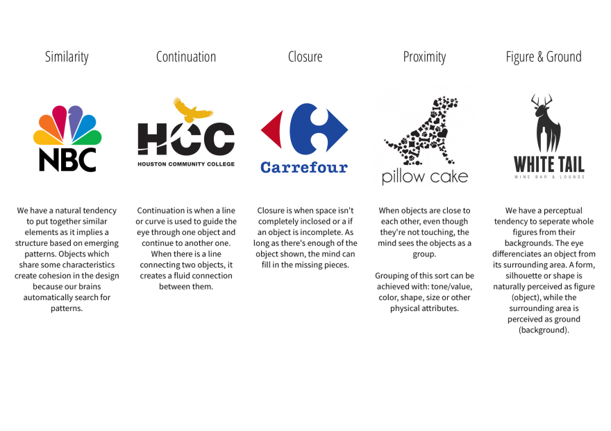
Page through a magazine or newspaper or browse the internet and find a different logo for each of the gestalt principles
These gestalt principles are:
– Similarity
– Continuation
– Closure
– Proximity
– Figure and ground
Find examples of themes of thinking and explain your choices
KISS (Keep It Simple Stupid)
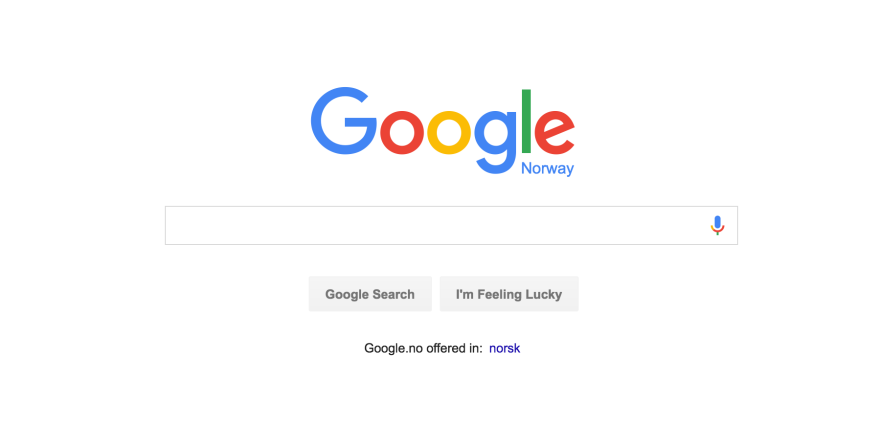
A great example is google. When you enter the homepage, the only thing you see is the google logo and the search bar. Straight away it offers what you came to use it for.
Focus
A good example would be a business card. A business card’s main purpose would be to provide with contact information. By focusing on those elements, a potential client would then be able enter your website which elaborates the details of what service/product is offered.
Ockham’s razor
Python philosophy
White Space

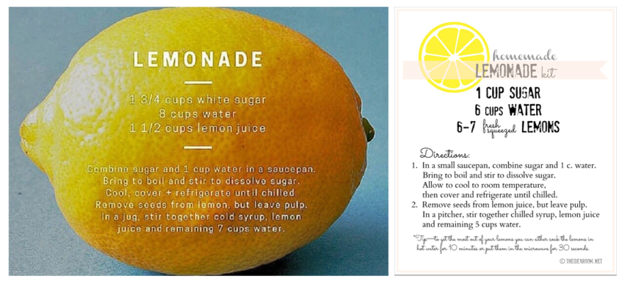
Text minimisation
These two recipe designs are a contrast to the same basic idea but a more cluttered version on the right. Where the text would include the words: ingredients and method. The visual break done with elegant spacing emphasizes the different sections.
Graphic impact
Scale
The app icons are a good example of this, as they have to be designed in such a way so they are readable and recognizable in the small scale on our smartphones.
UCD (user-centred design)
Ergonomics
TIMTOWTDI (there is more than one way to do it)
MA 00 Design Journey
PDF: designjourney
